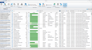
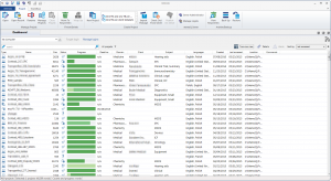
 On Friday, May 22nd, during the memoQfest conference in Budapest, Kilgray officially released memoQ 2015. One of its new features is redesigned Dashboard view – the screen you see when you start the application. And although it looks better than in previous versions, initially I was disappointed with the new filtering feature. But after playing with it a bit, I’m sold: it’s much better than before (with one exception).
If you haven’t seen memoQ 2015, dashboard now looks differently for translators and project managers.
As you can see, now you can see the standard project metadata set (Project, Client, Domain and Subject). You can also use “two column” view in both view versions.
Additionally in “translators pro” version users can use panel for even simpler project creation by dragging and dropping files. But that’s not what this post is about. Regardless of your license and selected view, you have access to filter bar. In the previous versions of memoQ filter bar was available only after checking “Project manager view” check box on the main screen, and it offered the following view:
By typing in the text field you could instantly (on the fly) filter by project name and/or description, drop-downs can be used for filtering by field values. Of course this works only if you do happen to use metadata in any consistent way (and if you don’t you should).
Now the drop-downs are gone and the filter does not work on the fly – you have to press Enter if you are typing in a keyword from project name or description. Which definitely is a step back. On the other hand, you can use the text field to filter for metadata in a way that’s even more convenient than the drop-downs. Just start typing the name of the category you want to filter by, e.g. “domain”, and memoQ will suggest you the rest. Just press Enter to insert category name.
Then start typing, and the software will display list of possible values starting with that letter. Press Enter again and you are done. Filtering is applied instantly.
I find this solution very elegant and convenient. Still, I’d love to see the return of “on the fly” filtering, although I’ll understand if that’s not possible. BTW, you can also filter all projects, active projects and recent projects (accessed within last 30 days).
* * *
During the last memoQfest session Istvan Lengyel, CEO of Kilgray said that the company is going to focus now more on smoothing out the rough edges in the software. And that’s very good. One area of such “roughness” concerns inconsistencies in the software. The new filtering system is available for projects, but all the rest of resources (TMs, TBs, corpora etc.) are filtered using the old method. I’d love to see the new system implemented in all those other places too, which would also lead to much better utilization of limited space in the software dialogs.


1 ping